October 30, 2003
Wag a what?
When I went to London with Mike, there were a few occasions where I wandered in the city by myself. On one of those occasions, Mike was full so I went to Wagamama, a must-visit Japanese ramen shop a friend recommended. The fare was delicious, the service superb (I love their little handheld order-takers), and the prices reasonable. I received their email newsletter this afternoon with announcements that they are opening a store in Glascow in December. Huzzah! But when will they open one in the US? New York! New York! You must come to New York first!
I took a peek at their menu made a note that the juice I loved was made of apple, orange, and passion fruit juice. I recently bought some passion fruit juice at the organic food store and some apple cider when we went apple picking. I'll probably bug my sister for some orange juice. Mm. I wish they posted the ratios, then I could drink that glorious wagamama fruit juice while I wait for the New York store to open.
October 29, 2003
Fonts! Fonts! Fonts!
Once I am on a fontaholic binge, it's really hard to stop. Normally, I just haunt the font shops that I buy from, primarily P22 and Scriptorium. I decided to check out old font shops that I liked.My first stop was Fonts Anon (Fontaholics Anonymous). I used to be a member of their group and remember constantly forgetting my password. It's nice to see that they've "opened up".
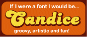 From there, I launched myself over to Fontlover, where I took a "What Font Are You" test and discovered that I was "Candice". I don't think I'm "Candice" at all. It's fun. It's disgustingly cute, but I don't think I'm a "Candice". I'm not groovy/funky enough.
-
From Fontlover, I started looking at old font foundries I've admired.
- Chank - I've always wanted to be part of the Chank Army. I'm not funky-artistic enough.
- Astigmatic One Eye - A fantastic type foundry with a very cool website design. I tried designing in this style: dark and heavy and heavily framed. I fail miserably at this style.
- Blue Vinyl - Very beautiful stylized fonts for a variety of occasions. I must buy Delorita when the right project comes along.
- Chris Costello - The guy behind Papyrus. Every fontaholic knows this beautiful font.
- Font Diner - Fabulous retro-style fonts.
- Font Head - Fabulous grunge-style fonts. I love grunge fonts, but never get the opportunity to use them.
- House Industries - I love this font house's limited edition prints.
- Robot Johnny - Creator of Baloney, a gorgeous brush-strokey grungy font that I've never been able to use in any situation. It's a great blog/journal too.
-
I was introduced to a number of new font houses as well, with fonts that I really liked. I just need to find the proper project for them.
- Blambot - Comic-style fonts that I will hoarde if ever asked to do lettering for a comic book. It will never happen, but it's nice to dream.
- Dust Bust Fonts - For my next techno-themed project.
- Font Bureau - It will take me hours to look through this extensive font library. Gorgeous fonts.
- Fuel Fonts - Some beautiful stylized fonts. Lots of mixtures of style.
- Fountain - Beautiful European-style fonts.
- Letterhead Fonts - Vintage-style fonts (Victorian era, especially). This would have been the perfect site to get fonts for my post-Moulin Rouge site designs. Luckily, those designs haven't seen the light of day. My designs are horrid.
- Lunchbox Studios - One of the best sources for grunge type, it seems. Which means I will never use the site.
- Nerfect - Mr. Walters is just one really cool guy.
- Psyops - I need to buy Retablo sometime soon and use it. Beautiful font. Cool site.
October 28, 2003
Fontaholic Falls Off the Wagon
From what you can see on the left, I dropped off the wagon and bought a new font. This time, it is a Halloween-specific font from Scriptorium. It's not a typical font, it's a font where the characters are graphics, often called a "dingbat". They make for great graphic elements if you can't draw (like me). Scriptorium is run by Dave Nale and his response time astounds me. I'm a member of their Font Club and it's great to get a new font frequently, especially fonts as beautiful and 'handmade'.Chinese Chop!
I've decided to order a personalized Chinese chop for my artwork and website and other fun stuff. I've wanted one ever since seeing an artist make one for LeVar Burton on Reading Rainbow. A chop is a stamp, made out of marble or soapstone, that is dipped in red ink and applied as a signature to artwork or official documents. I've started looking at possible suppliers:- Supply Curve offers a nicely packaged chop, but I'd like to have the letters in ink instead of the whitespace around it.
- Good Orient offers very inexpensive chop deals, but I'm hesitant because there are no examples of the seals. Perhaps, I will look them up when ordering a gift for someone.
- elegant art international has some beautiful looking seals and I have contacted the artist about ordering a chop.. or two.. or three from him based on some questions I have.
- China Bookstore is located in Boston and I sent an email with questions and more information about ordering chops from them.
October 27, 2003
Still Playing
As you have probably noticed, I have now added cool drop caps to the beginning of each entry. This is done through the Fahrner Image Replacement technique. However, I found a more efficient model on Seamus Leahy's website. Hooray for CSS!October 24, 2003
Skin Me, Baby & More Internet Communities
I decided to adjust my website to be a CSS playground. As much as possible, I am stripping away the look and feel from the content. This page, for instance, contains no tables or images within the HTML: the design is implemented in the style sheets. Although style sheets have some limitations, they are growing fewer as browser-makers become aware of standard implementations. I've become aware of another level: skinnable websites.
I'm not sure if this is the hot new thing, an old fad that I'm just discovering, or something that's considered cheesy by most people. I do now that it's something that I'd like to learn to do for my site. It should be fairly simple to implement, especially since I've already done the "hard work", the separation of design and content.
-
I've collected some interesting resources that will prove useful:
- domesicat.net's skinning a website tutorial, which looks like the resource out there for skinning
- love-productions.com's moveable type skinning help, which might prove helpful
I've also been introduced to two interesting new communities, geek-chick.net and blogbarter.com (from Dreama). I will be eyeing them with interest.
Neil Gaiman STUFF
I've purchased a number of DVDs, CDs, and magazines that I have yet to peruse. I've bought only one book in the past month, Thomas Harris' Red Dragon, which isn't really a new book, but one that I've already finished but found it AWOL from my shelf. I have decided that I must watch all my new DVDs and CDs before I put my order for new stuff. Specifically, Neil Gaiman stuff.-
Neil Gaiman stuff I need to get:
- Telling Tales CD, Neil reading some stories
- Warning: Contains Language CD, more Neil reading stories with art by Dave McKean
- Signal to Noise CD, a radio play with Dave McKean artwork and voicework
- Shadow of Baker Street collection, Sherlock Holmes stories within the world of H.P. Lovecraft, Neil a contributor
- Winter's Edge, comic anthology with a Desire story
- Welcome Back to the House of Mystery, comic anthology with a clear reference to Cain and Abel on the cover
- Sweatshop #5, written by Peter Bagge featuring Neil Gaiman as a character
- Sandman, King of Dreams, written by Alisa Kwitney about the creation of the Sandman series
- Hill House Publisher's limited editions of American Gods and Neverwhere, which is a bit of a debate since they are $200 each (should I?)
October 23, 2003
Studio Ghibli 2004 Calendar
The images for the Studio Ghibli 2004 Calendar are released. For the uninitiated, Studio Ghibli is the animation studio behind Hayao Miyazaki's work. These include Porco Rosso (The Crimson Pig), The Castle of Cagliostro, Mononoke Hime (The Princess Mononoke), and Sen to Chihiro (Spirited Away). I am looking forward to Howl's Moving Castle, which will be released soon and Porco Rosso, which is rumored to have an American Disney distribution.